Problem
As lead designer with a small team at amply, my role was to create a new website for Nectar. They already had one successful product, but were expanding with two additional complementary services. The main challenge was to present these new offerings clearly and explain how each of them works.
Research
After a deep dive into understanding Nectar’s clients and what they are actually looking for, we also analyzed competitor websites to see how they differentiate their products. This allowed us to understand what similar companies are doing, avoid copying their solutions, and learn from their mistakes.
Solution
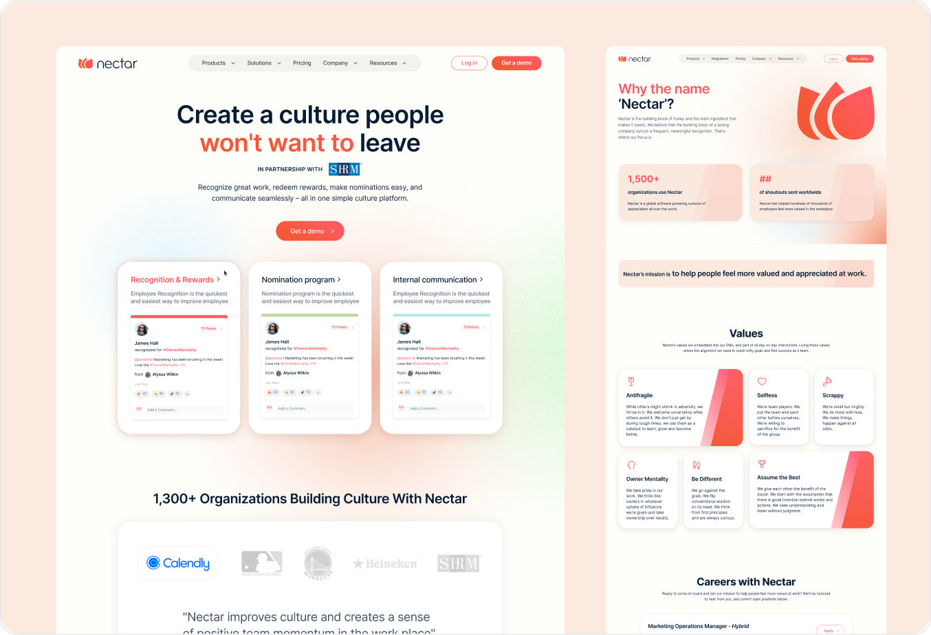
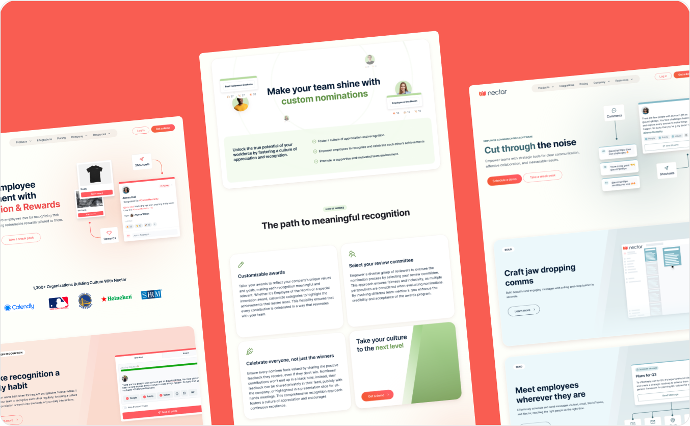
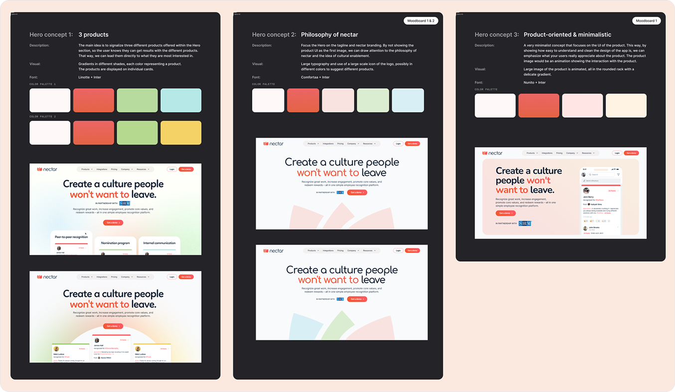
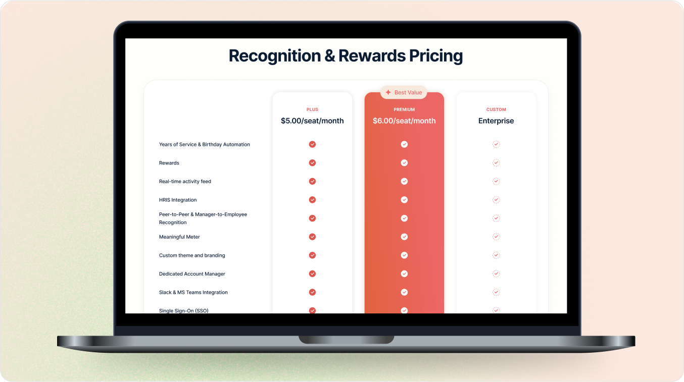
The solution I chose was to use color coding for each product. Nectar already had carmine red as the main brand color, so we kept it for the main product. We added complementary colors—blue and green—for the other products. These three colors appear subtly throughout the homepage, while each product’s subpage is highlighted with just one specific color to maintain consistency.
See the static homepage design below:
Design process
After researching competitors, we created mood boards for the client and used their feedback to design the hero header. This set the visual direction and allowed us to refine creative ideas before tackling the full homepage. Designing the homepage first provided a blueprint for the rest of the site, ensuring a consistent style and speeding up the design process.
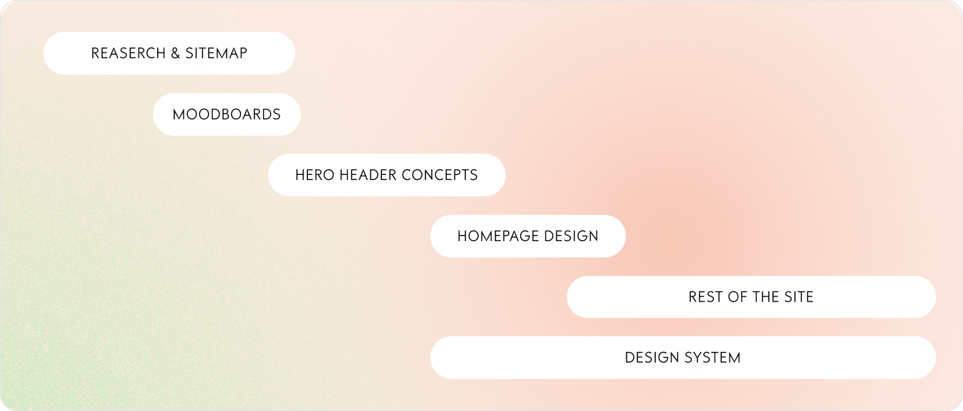

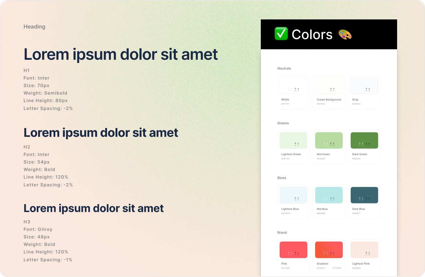
Design system
While working on the homepage and the rest of the site, we developed a design system that consolidated all key elements into reusable components. This approach allowed us to maintain consistency across the site while still enabling flexible and engaging variations within the components.
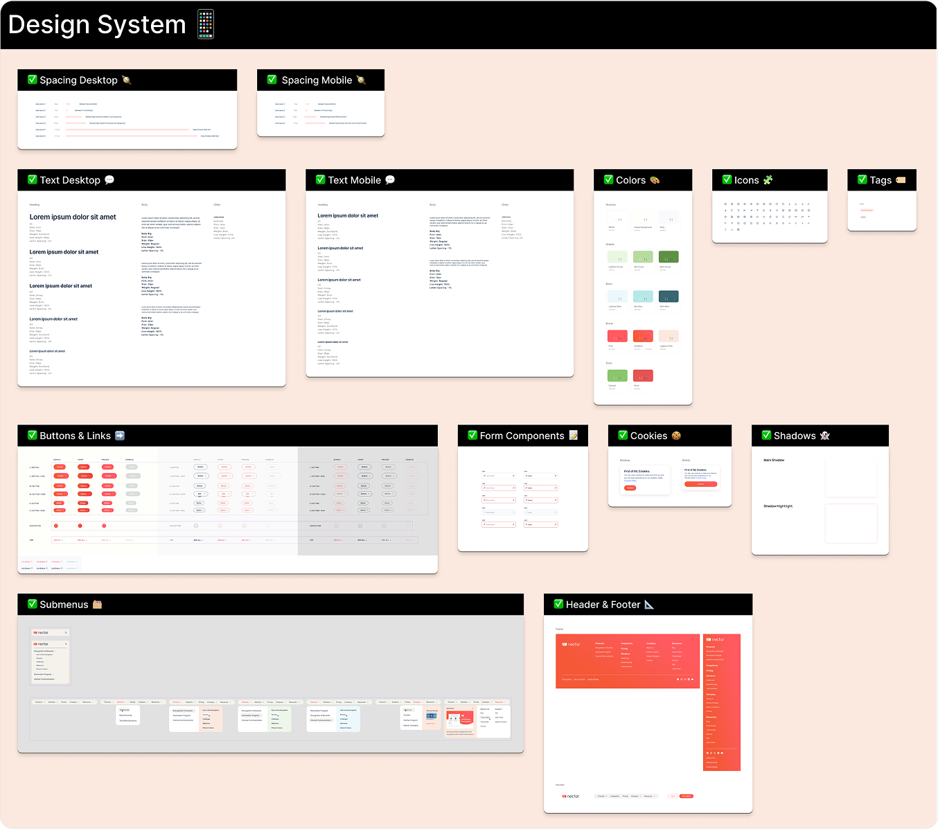
Illustrations
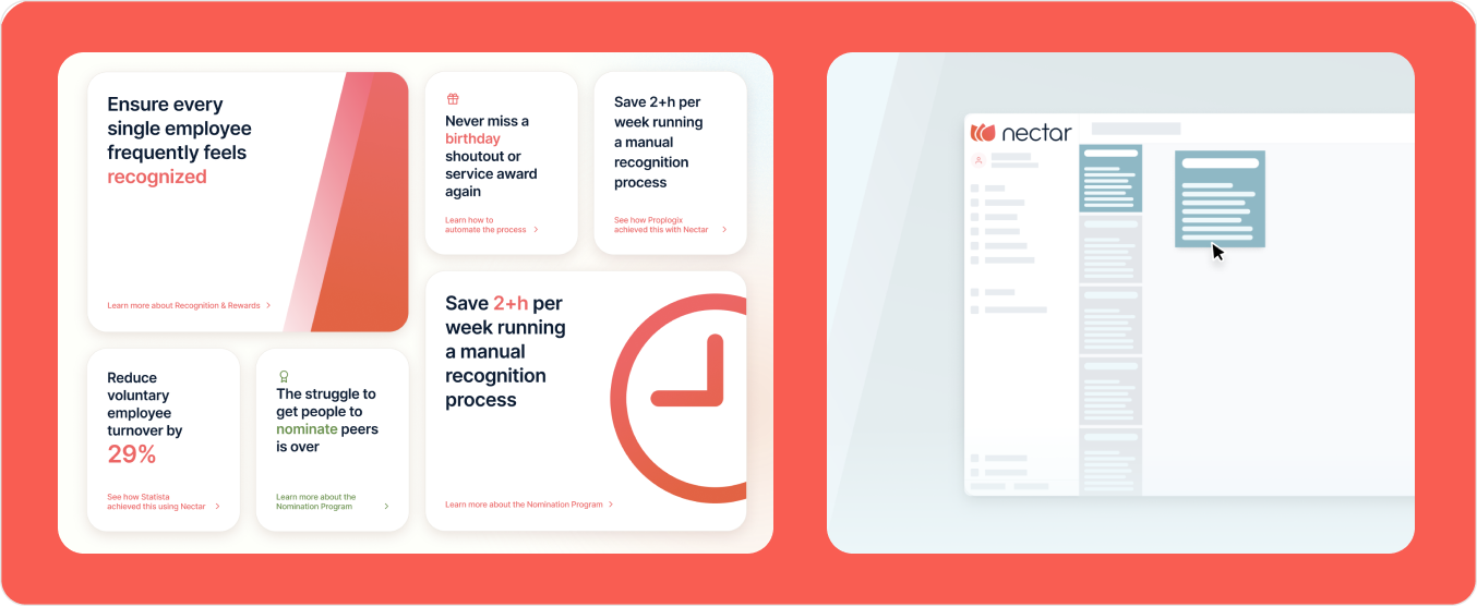
The site uses two main illustration styles. One combines product screenshots with icons and subtle lines ending in dots to emphasize key areas. The other uses simplified chunky icons and UI elements to visually convey the product’s underlying concepts.

Typography & colors
The main font used throughout the site is simple and modern. It needed to be understated, not drawing too much attention to the typography, allowing the colors to take center stage. For all products, we need to create a cohesive color palette consisting of various shades of the three primary colors: green, blue, and our brand red.